Source: Athena Calderone, Eyeswoon
I am starting to crave more color in my home. Maybe it is because we have been in lockdown for nearly a year or maybe it is because Spring is here, and things are getting more vibrant outdoors. Not sure, but either way, I am craving more color in my life.
I finally have a plan to go through with the wallpaper in the bathroom po(WOW)der room and that is going to add a huge shot of color to my otherwise mostly black, grey, and white house but I will save those details for another day.
Today, I am going to share some moody colors that you can use to create a vibe in your home that is cozy and yes, even warm. Here are a few of my favorite moody, dark paint colors and a few tips to make sure that your room still feels cozy rather than like a dark hole.
Bring in light furniture and accessories. Pairing the light with the dark will enhance the contrast and really help your accessories shine. When done right, the dark walls fade into the background. Use mirrors to reflect natural or artificial light and use mirrors and artwork to break large stretches of blank wall.
Use muddled paint colors with an eggshell sheen. Primary colors like red, blue, and green are not what you are going for! Look for colors that have a touch of black or gray which will be bold but still neutral.
Start small. The powder room is a great place to experiment because it is not part of the open floor plan (obviously!) so you do not need to worry about how to transition between the spaces. It is also a room that you only spend a short amount of time in and so it can be a little crazy
Put a sample on the wall and view it throughout the day. Colors can really change throughout the day based on the amount of light.
Moody Blues
I have to start with blues since they are the most popular and also featured in the title of this post. Blue can be really versatile (pretty much no one hates blue) and it creates a feeling of peace, tranquility, and nature within a space. Blue is a great color to feature on a kitchen island if black is too dark for you.
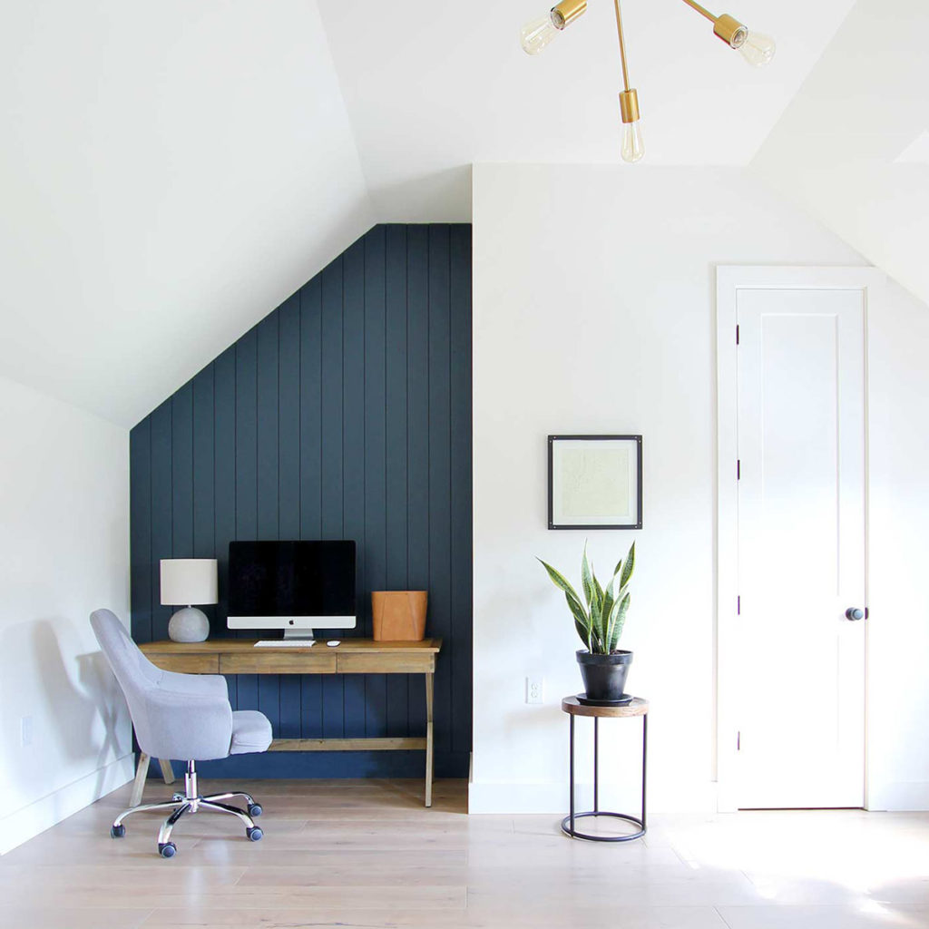
Hale Navy by Benjamin Moore
Hale Navy is a timeless, classic, deeper shade of navy. It works equally well across many styles such as traditional, modern farmhouse, and mid-century.
Source: Plank and Pillow
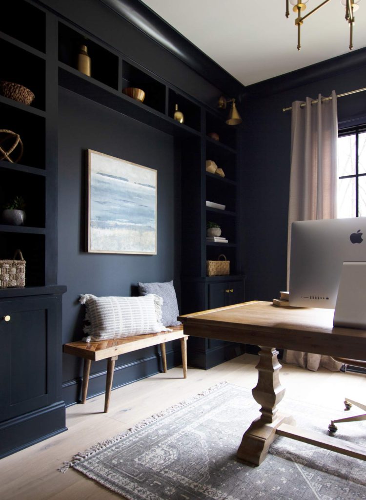
Inkwell by Sherwin Williams
If you think that you want black but are concerned that it may be too cold, Inkwell may be the color for you. It is a deep, moody blue that can really wrap an entire room in a bold, but a warm hug. It looks especially great when paired with lighter-colored floors, rugs, and furniture pieces which really end up being the star of the show.
Source: Plank and Pillow
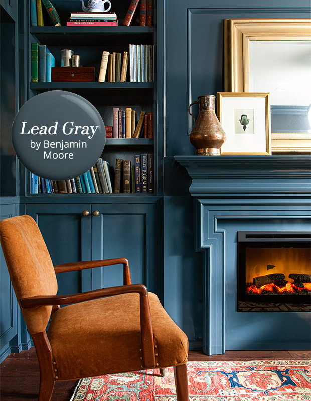
Lead Gray by Benjamin Moore
Although this one has gray in the name, it is really a deep blue-grey that looks like the dark sea. It is dark and moody, but also rich and warm and is a great color for a study or office.
Source: House and Home
Deep Green
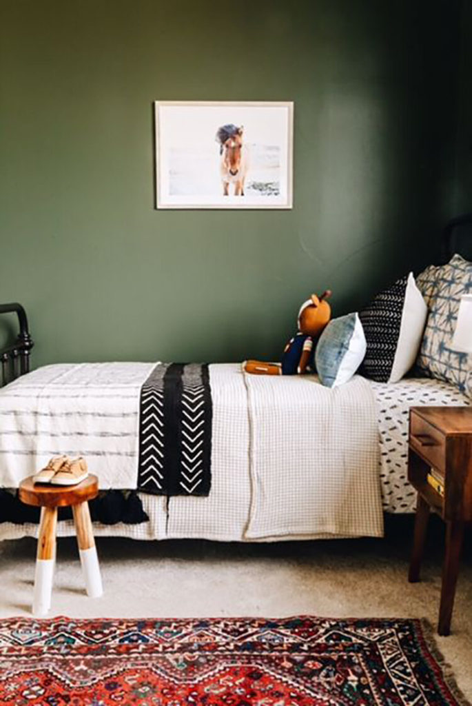
Backwoods by Benjamin Moore
Dark, earthy, and nature-inspired, this color provides a calm background for a bedroom and would also be great in a den or study.
Source: Lauren Koster
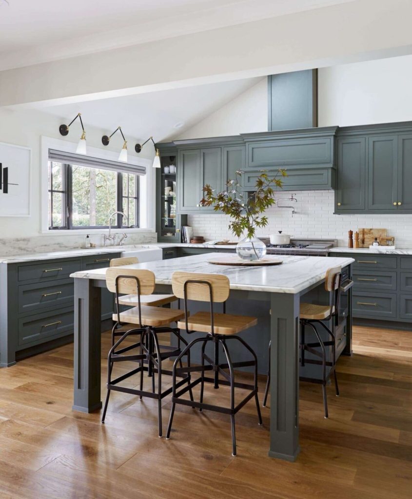
Pewter Green by Sherwin Williams
Sherwin Williams Pewter green is the definition of muddled – it has just the right amounts of green, blue, and silvery gray so that it does not look like you put a green traffic light on your walls. It is great for kitchen cabinets as shown below and provides a cozy color for an office or den.
Source: Emily Henderson
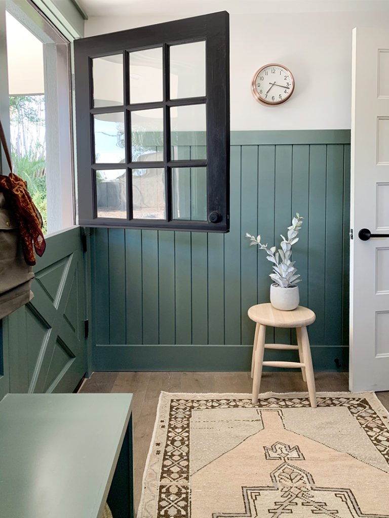
Caldwell Green by Benjamin Moore
With a bit more grey, Caldwell green is a serene color that works well in larger spaces and also looks great in entry and laundry room!
Source: Juniper Home
Charcoal and Black
Deep charcoal grey and even black adds drama to a space and creates a bold and luxurious feeling.
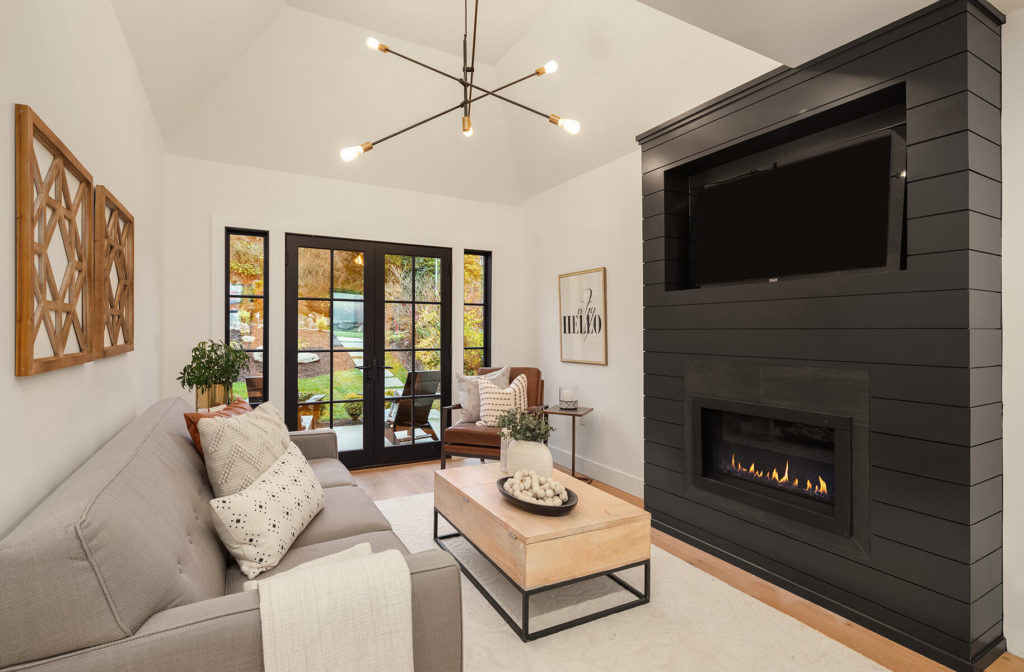
Tricorn Black by Sherwin Williams
It is challenging to find any list of perfect black paints that do not have Sherwin Williams Tricorn Black on this list. It is a rich, natural black with no undertones which means it is perfect for pairing with lighter colors including white.
Source: Tara Nelson Design
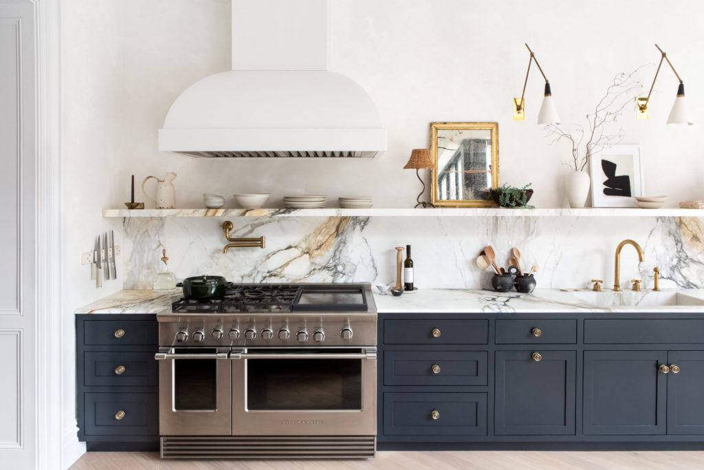
Railings by Farrow and Ball
Railings by Farrow and Ball is a great black option that gives off a hint of blue and looks great on cabinets. If you do not recognize the name Eyeswoon or Athena Calderone you need to get on Instagram and check out her account and her books stat! I really need to do an entire post on her as she is my modern design muse.
Source: Athena Calderone, Eyeswoon
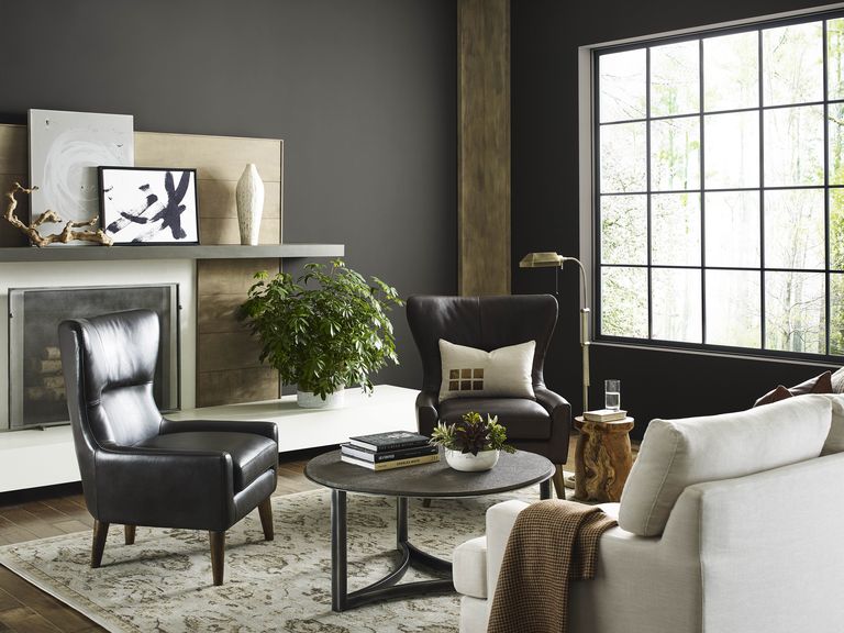
Urbane Bronze by Sherwin Williams
Urbane Bronze is another color that you will find on nearly every list of great dark colors for good reason, it is a rich, dark but warm paint color that was recently named Sherwin Williams’ paint color of the year for 2021. Because it has some brown tones, it pairs well with rustic wood and neutrals.
Source:Welsh Design Studio
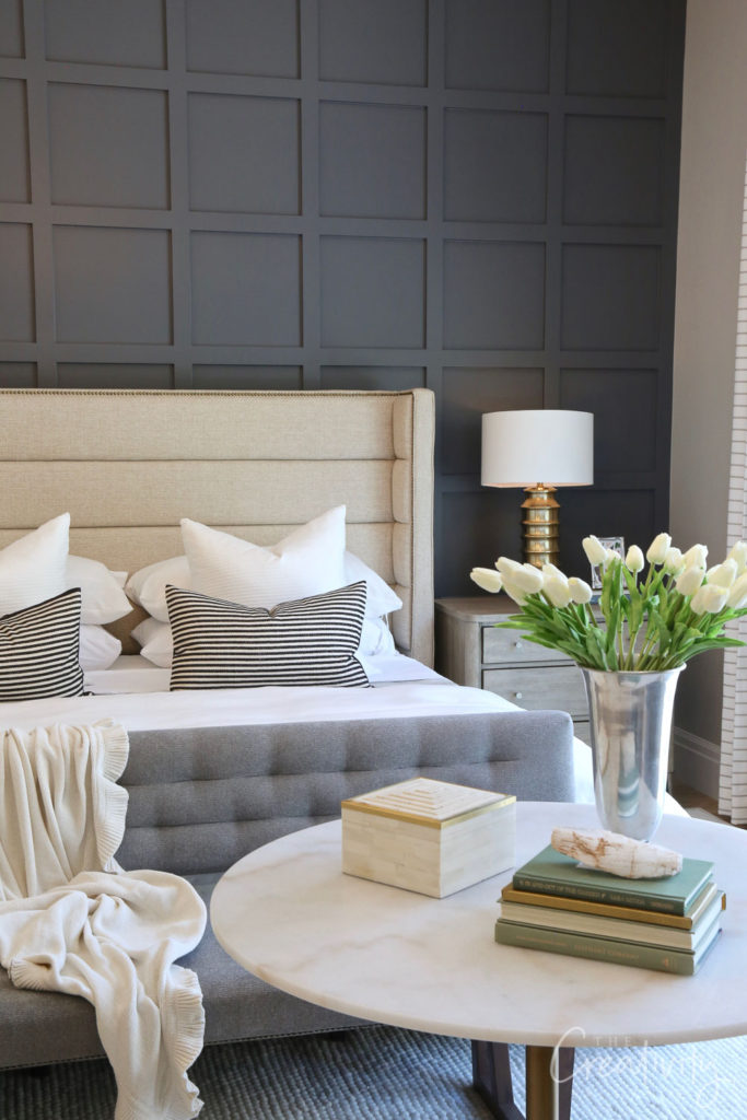
Sherwin Williams Peppercorn
Peppercorn is a rich, charcoal shade that goes with everything. Softer than black and pairs nicely with white, green and really showcases neutrals.
Source: The Creativity Exchange
